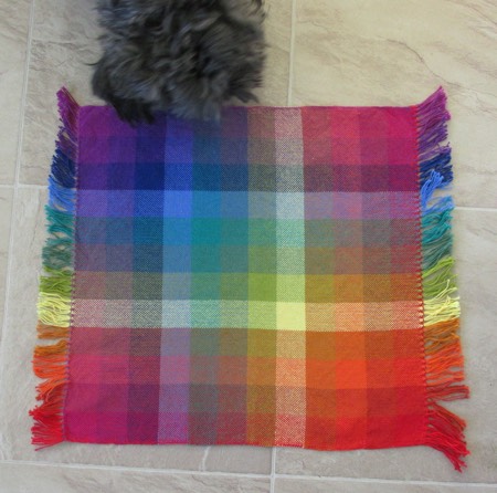
This morning I pressed the hand painted silk scarves and the sample for the COE. (Realized after I’d put away the iron and ironing board that I haven’t yet pressed those cotton & linen towels. Next time.)
I tried a variety of locations and layouts to photograph things outside in the shady natural light. Mostly it was too breezy, but even when I managed to get a shot that had only a little movement in it, I didn’t think it showed off the scarves very well. So back into the studio I went, laying them out individually on the floor and taking my photos. It was sometimes a challenge to keep Jack from photo bombing. I decided to let him on the COE sample but had to keep him away from the silk.
I am HAPPY! The first time I wove a sample I had to weave it three times to make it acceptable. The second time I had to weave the sample twice to get it right. This time I go it right – that is, with the squares actually square – on my first time!
I’m going to weave off the rest of the warp for a towel. It will both lighter weight and narrower than I usually make a towel. It will work for my kitchen or for a gift, but I won’t sell it.
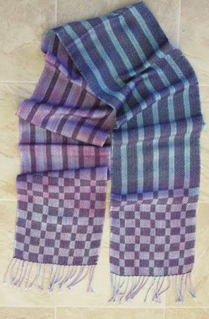
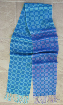
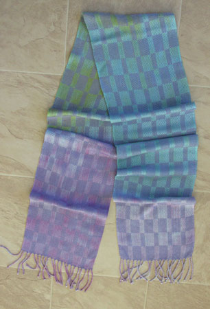
On to the glam shots. First up are the hand painted rayon scarves I wove in March but never posted. I’ll start with my least favorite and work to the one I like the best. All are woven in twill blocks with different treadling patterns.
Way too dark for me is the purple weft. I also don’t like the treadling in this one. I used a similar treadling pattern with the silk hand painted scarves I did last time and really liked it, but now, not. I also don’t like how long the color changes are in this scarf.
Way too bright for me is a very bright peacock blue weft. The color changes are way too long again. The consistency of the squares is somewhat pleasing, but not the look I like best.
Rather like Goldilocks, I find this scarf just right. I love the periwinkle weft, am ok with the length of the color changes, and like the treadling.
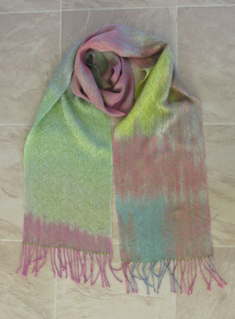
Now for the silks. This is the first warp dyed in my second session, when I had a better handle on how frequently to transition the colors. I like each of these scarves for different reasons.
First up is the celery cashmere-silk weft. I like it much better up close than at a distance. I’m not crazy about the places where I used two colors in one section, but it’s interesting.
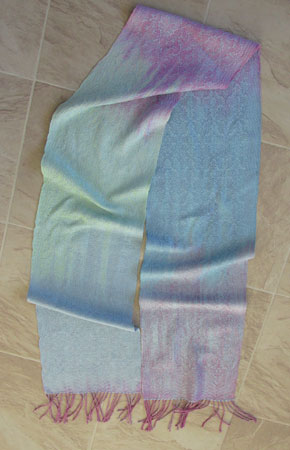
Next up is the light blue silk weft. First a close up, just ‘cuz I love it.
And now for the whole scarf. Subtle, but quite nice.
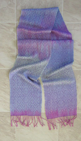
Finally, the royal purple rayon weft. You saw a closeup in the last post, so I won’t give you another here, just the whole scarf.
Hmmmm…..what will I weave next?


I love the pic with Mr. Jack the best!! He’s a good helper!
So well done!
So much fancier than your scarves from, ohhhh say, 2009.
Thanks, Theresa. You are very kind.
Oh gosh, all so beautiful! Great glam shots….