Today I hard pressed & labelled MP’s two wraps, the last steps in finishing them.
Here they are, full width. On top is the hearts & flowers weave pattern with a black cotton weft, on the bottom is zigzag with a marine cotolin weft.
And here they are up close.
Although the colors pop a bit more with the black weft, I still think that the zigzag shows the gradient better. It’s generally my opinion that it’s best to have either complex color patterns or complex weave patterns, but not both. Maybe it’s just my eyes that get distracted…..
Still, I’ve definitely used both at times. Sometimes more successfully than others.
This is the last shot of these two wraps before they’re packaged.
After I got back from the post office, I went back to my warping mill and finished winding the warp for the next 2 wraps – for H & H. These two women don’t know each other, but are becoming baby wrap sisters.
This is the most colorful section of the warp. From the top down it’s aquamarine, rose fonce (dark pink), bleu (blue), and seaton (pine). The color names are all in French since the yarn comes from Maurice Brassard, a French-Canadian company.
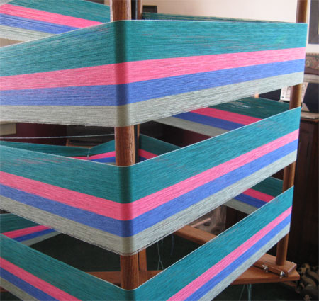
This section is mauve pale and aquamarine.
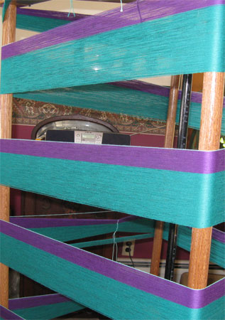
The other two sections are solid aquamarine. I really do like that color.

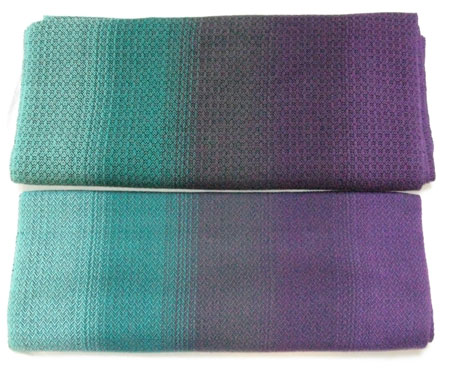

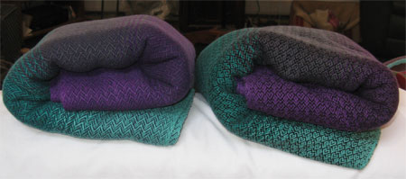
I love the transition between colors on the finished wrap! And gorgeous colors!
Thanks, Erika!
You know, I usually LOVE the heart pattern, but I think I like the zigzag better this time around, too.
Isn’t it interesting how things strike you differently at times? I have no idea why, but it’s my experience that it’s true.