Archives

Color me surprised

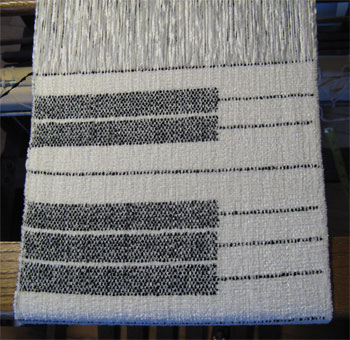
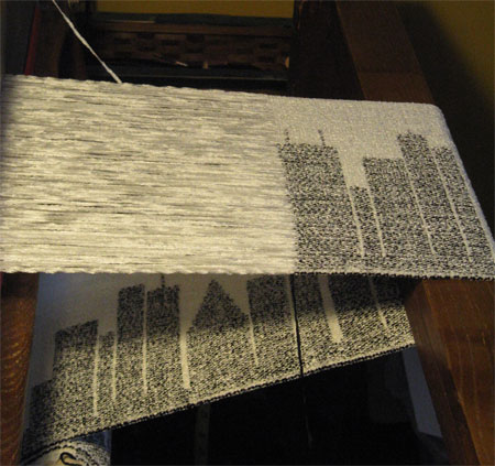
Yesterday I finished weaving the second piano, hemmed & wet finished the 2 pianos & the cityscape.

cities & pianos

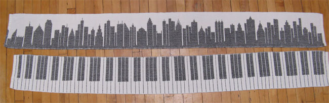
I expected I’d prefer the pianos, that’s why I wove 2 of them and 1 cityscape. But no. When I see them side by side I prefer the cityscape. Just goes to show you, what appeals on the loom isn’t always what appeals off the loom.

I’m sure some people will really like the pianos, especially if I get into one of the shows at Chautauqua Institute, so I’m not worried.

If I do the pianos again I’ll actually follow all the calculations I did ahead of time — this time I went by my eye, what looked good at the loom. The final result looks fine, but has 3 extra octaves. It’s not a big deal, I’m sure, but it’s not an accurate piano keyboard. Hey, it’s art, right?

So tell me — which appeals to you: the cityscape or the piano?

Tickling the keys

Y S-B jumped on the opportunity to buy the wrap with the royal, chambray, & navy weft. So I got both wraps hemmed, washed, dried, pressed, & labelled. Today I mailed out Y’s wrap to Germany and HF’s wrap to New Zealand.

HF & Y S-B's wraps done

Mailing things out of the U.S. costs SOOO much more than mailing within the States.

Before I start the next baby wrap warp I went back to the rayon chenille warp I have on my counterbalance loom. Instead of weaving another cityscape, I decided to weave a piano scarf. I’ve been wanting to do this for a few years.

piano scarf

I’d love to tell you that this was my idea, but it wasn’t. The talented weavers over at Dust Bunnies Under My Loom did it way back in 2011. It took me a few years to have time to figure out the weaving technique, and then I did my cityscape scarves. They were my own design, & I’ve never seen anything like them. But I couldn’t get that piano out of my mind. And since I’m not looking for this to be a juried piece, I’m not overly concerned that I borrowed (ok, stole) the idea. I did have to figure out all the measurements and layout myself, but still….not my original idea.

I’ll have to decide if I’ll do another cityscape or a piano for the third scarf on this warp.

All natty

HF's wrap, top & bottom

As planned, today I finished weaving the not-AM wrap and started on HF’s. She chose a natural cottolin weft. The yarn has an extremely natural look on the cone – a bit fuzzy, the color not as definitively solid as dyed colors. Interestingly, on the loom, at least with the CFL bulbs in my weaving lamps, it looks like a solid creamy white. Huh.

I’m glad that I got about half of H’s wrap woven today, since I won’t be able to get as much done tomorrow with some other commitments I have.

I’ll be able to finish the weaving on Wednesday morning, then cut the wraps from the loom & hem on Thursday. Then I’ll go back to the rayon chenille & get two more scarves woven off.

There’s always a first time

I have bought many dozens of tubes of cotton from Maurice Brassard since I started weaving baby wraps. I’ve commented to the staff at The Woolery, where I order from, about the fact that there’s never any difference in dye lots. In fact, the yarn isn’t even marked with dye lots. If I order magenta yarn in July and again in January, I can interchange those two yarns with no problem – they are always the same.

Until now. I started weaving AM’s custom wrap with royal blue. I got about 40″ woven when I finished one tube and started another. Uh oh! Quite a difference between these 2 blues – your eye catches it immediately.

I exchanged emails with A discussing the problem and proposing a few different solutions. In the end, she decided she would pass on the wrap. No problem, I’m sure I can find another buyer in a flash. So I got to decide how I would weave the rest of the wrap.

I decided to weave 3 heart motifs in chambray, a very pale blue, and then 44″ in navy. Now almost at the center, I’d weave 5″ of chambray, another 44″ of navy, 3 more heart motifs in chambray, and finish with 40″ of the second dye lot of that royal. It will be hardly noticeable that the dye lots are different. I will, of course, make that clear to potential buyers.

weft color changes

While I was in discussion with A my weaving was at a standstill. I took advantage of the opportunity to put a rayon chenille warp on my little counterbalance loom to weave some cityscape scarves. I got one done before I had A’s final decision and could go back to the Macomber and the baby wraps.

2015 cityscape

Tomorrow I’ll finish the remaining 40″ on the not-AM wrap & start weaving HF’s.

Pick one

I gave each of the three red-gradient shawls their hard press today, knowing in advance that this would be where I would decide which was best for a hands-on jury.

I think the gold silk weft is my favorite from a distance of 1-3′.

reds and gold shawl

Closer than that I think the beat looks a bit uneven. Worse, in the photo you can see a treadling error. So it’s out.

Next up for me is the silver silk weft. I like the contrast with the reds and the beat is nice and even.

red shawls with silver silk weft

Unfortunately there’s some kind of imperfection. I can’t figure out what caused it, but it’s really obvious up close. So it’s out, too.

imperfection in silver shawl

That leaves the navy rayon weft.

reds shawl with navy weft

Although I don’t think it’s the most photogenic, it has an even beat and no imperfections. That’s the one I’ll submit for hands-on jurying.

Thought you might like to see how different the two sides of this weaving look…this happens to be the gold weft.

both sides of shawl

Tobie asked for the draft of this pattern. Here’s a bit of it.
reds shawl draft

I thought I could upload and link to a wif file, but apparently I can’t. So if you want the full wif download, email me (peg at handwovenscarves dot com) and I’ll send it to you.