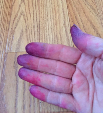
Yep, dyeing. Specifically hand painting. And I have yet to find rubber or latex gloves that fit my small hands, resulting in my inability to do some things with gloves on.
This time I actually wrote down the ‘formula’ of amount of dye to urea water so I will know how much to use to get a similar level of color.
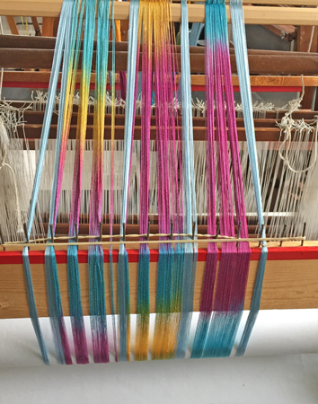
I started by hand painting 3 narrow strips of 30/2 silk for a scarf, with the plan to separate those strips with narrow stripes of solid silk in a coordinating color. Then I moved to hand painting 5 bouts of a thick-ish 5/2 rayon for a shawl.
I intended to use the same technique for for both of these dye projects that I had when I dyed that cotton, but when I started with the silk, I was having quite a bit of difficulty moving the warp up to get to the next section, so decided I’d just paint each section individually with the same colors instead of doing some of the planning that I had with the cotton.
After I dyed the silk I thought I might as well do the same thing with the rayon. Same colors, no planning of where they’d land on the warp.
There was now quite a bit of yarn dyed. I had to steam the silk so steamed the rayon, too, although not as long. I decided that I’d keep all the yarn warm overnight to really set that dye by putting it all in the oven with the element from my dehydrator plugged in and set on the oven floor. It worked well and I’ll definitely do that again.
While I waited for the dye to batch overnight and rinse, I wove some simple Swedish lace cotton scarves with the plan of ombre dyeing them.
Ok, back to photos…and now there are lots.
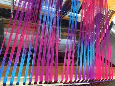
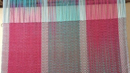
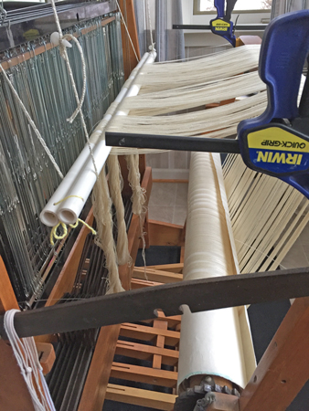
First I beamed the rayon. You can see the sheen on it even in this state.
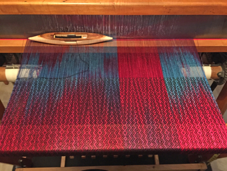
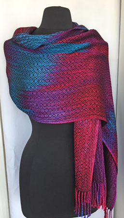
I threaded for an complex twill, using a draft Susan Harvey had shared on her blog a few years ago – thanks, Susan! I used an advancing twill treadling, and picked black Tencel for the first shawl.
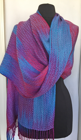
I really liked it. As usual for me, I wanted to weave the second shawl with a different color weft, and after trying a few options I settled on periwinkle Tencel. This looked nice, too.
Wove both off, removed from the loom, twisted the fringe, wet finished and pressed, and took some quick photos. The plan is that all this hand painted weaving will go to the professional photographer for photos for this year’s jurying, so I didn’t feel like I needed to spend lots of time on my photos.
I honestly don’t know which one I prefer.
I think I’ll take both to the photographer since one may show better in his studio.
Would I have preferred the color layout with the greater amount of planning while dyeing? Maybe, but I’m not unhappy with these and it was much easier to do.
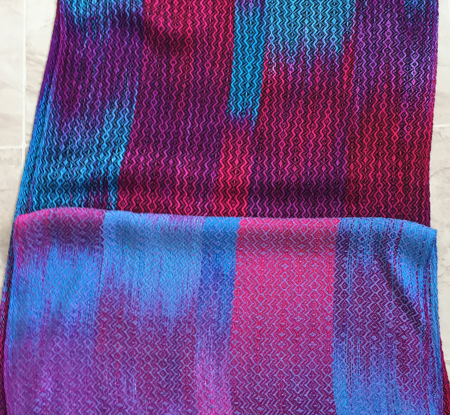
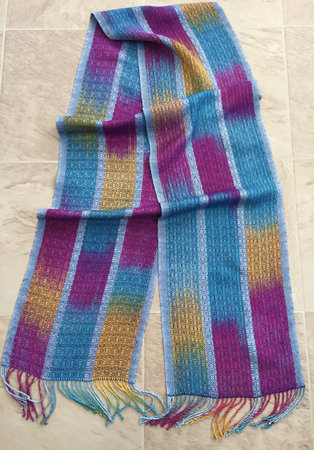
Next up was the fine silk. I used a baby blue solid silk for those stripes.
I found it interesting that the rayon and silk took the dyes differently. I used the exact same blue and red on both the rayon and the silk. In fact, I had intended for the rayon to be different colors, but I’d mixed up too much for the silk and didn’t want to waste it, so used it on the rayon.
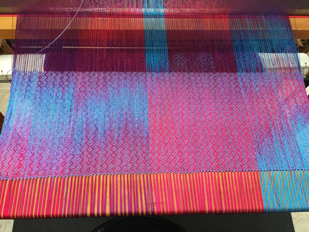
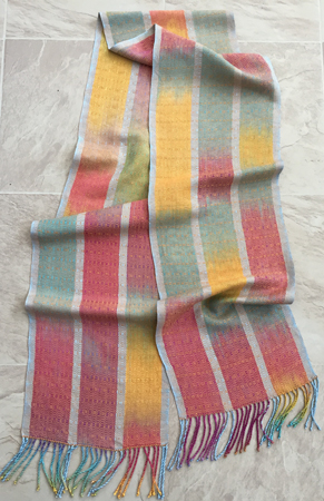
Anyway, after trying out a few wefts I settled on a burgundy tram silk for the weft for the first scarf. Tram silk is VERY fine, and was used as weft for kimono, so it has a really high sheen and great hand (drape). I used 2 threads together as my weft to begin to approach the thickness of the 30/2 warp.
I had threaded the loom for Ms & Ws, but decided I liked a simpler treadling for this scarf.
For the second scarf I used a royal purple cashmere-silk blend, and went for the full Ms & Ws treadling. The weight of this yarn is pretty much the same as the warp.
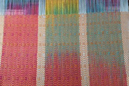
Then I went with a gold 20/2 silk for the weft for the last scarf, and modified the treadling a bit. This weft is a bit heavier than the warp. I loved the impact it had on those warp colors.
Then I twisted those fringes – a much slower process since the threads are so fine – wet finished, and pressed. Again, simple photos because they’ll go to the professional photographer.
Look how different each scarf looks due to the weft color.
I really don’t know which is my favorite now — do you have one? I’d love your input.
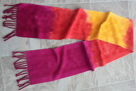
Okay, now to my less-than-successful ombre scarves. You might remember my first ombre dyeing experiment with Rit dyes. I dip dyed them. I liked them okay. My dye teacher suggested I paint the dye on for a different effect. So I did.
I have to say that although these scarves are okay, and I’m sure will appeal to some people, the effect was most definitely NOT what I wanted, and these scarves will not be used for jurying photos. I’m glad I tried the effect with cotton first.
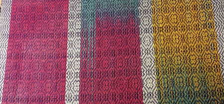
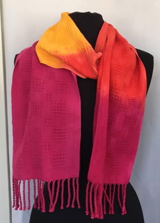
With that said, here’s the first one: red to orange to yellow and back again.
Not great laid out like that, but it totally works on the mannequin. At least I think so.
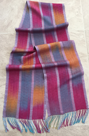
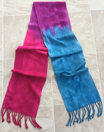
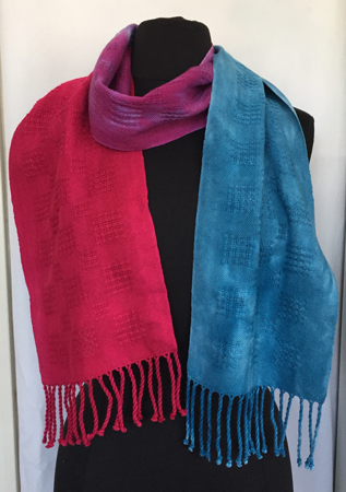
Next up is red to purple to blue. I didn’t reverse the color order on this one.
Again, I like it much better on the mannequin. But I’m not happy with the splotchy-ness of the blue.
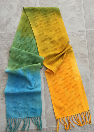
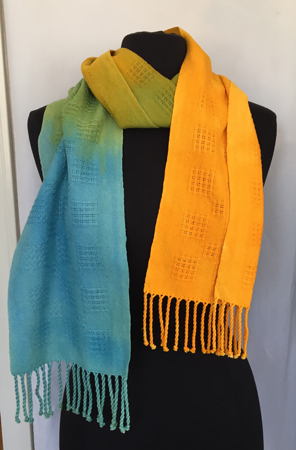
And finally, blue to blue-green to green to yellow-green to yellow. The yellow-green looked too dark to me in the cup so I kept lightening it before I painted – maybe too much.
Again, better wrapped.
I’ve been playing full-time grandma all week, and only have some time mid-day on a few days when both kindergarten and daycare combine to run back home and work. Next week I need to take better photos of those cotton scarves for my Etsy shop.
Since the cotton is not what I wanted, I knew I had to get another piece woven for those photos. I decided on a 20/2 silk shawl, and wound 880 ends, beamed, and threaded. I’ll share more as I’m able to weave them. Sure hope they will look as beautiful in real life as they do in my mind!

How fun to get to play so much Peg. My favorite of the 2 shawls is the first more vibrant one. My favorite of the scarves is number 3 of each group. It’ll be fun to see them in person.
Thanks, Judy. I always appreciate your input.
Peg,
Email me – I found half a box of size small gloves – that I no longer wear – would be happy to mail them to you.
Email me with your address.
Thanks so much, Charlene, I’ll do that.
All so appealing and beautiful, but the scarf with the heavier gold weft is my favorite and a very close second is the red/orange/yellow and back. Reminds me of a Tequila Sunset. Are those Irwin Quick Grips holding a raddle?
Thanks, Theresa. I think I like the gold best in person, but am not sure if it’ll make the best jury photo. Maybe I need to bring 2 of those to the photographer, too. Thanks, too, on the cotton non-ombre dyeing as well.
Yes, those Quick Grips hold my raddle. I’ve used them for years.
Wow!
Scarf #1 was my favorite until I saw the shininess of scarf #2. What a wowser!
I like vibrant colors, so in the next group I go for #2. In the final group I’m really impressed by #3. I didn’t expect to like it best, but I do.
Didn’t know #2 is in daycare. How does he like it? Is he reading and writing yet? What have we learned so far in kindergarten? Are we on brain surgery or advanced languages yet?
Thanks, Alma. I appreciate the input. The little one is in daycare 3 days/week, as was his older brother. It’s been part of his routine for almost a year now, so he’s good with it. Kindergarten is lots of fun, and although we say that art is our favorite subject, we excel at math.
Love your colors – what fun and cheery in the winter. Have you tried going to a large Pharmacy that handle home medical items. They sell boxes of gloves latex or nitrile. I have small hands and prefer now to use medium – small is really tight for me. Saves colorful hands.
Thanks, Charlene. I simply never remember that I need to find other gloves until I’m all ready to dye! But if I put it on my on-going list, maybe I can actually get gloves that fit 🙂